As I'm trying to get myself more exposed as a designer, I have created a Behance account to showcase my work. Although not all of my work is on there at the moment I am hoping as the year progresses it will gradual become a collection of work that I am proud of. This gives me opportunity to get my work online for other creatives to critique and give me feedback on.


I also finally made an Instagram account for my design work. So far this appears to be increasing in followers the more work I put on. My biggest issues I've faced the past two is having the confidence to be proud of my work and to put it online, its a task I've had to really shout at myself for as how will people know me as a creative if they cannot see my work. Therefore I have chosen to stop being a wimp and not think about being judged and just get myself out there. 


Here is a website I built on WordPress in September. It showcases the work I have made so far giving descriptions of the briefs I have made and how I have found the solutions to the briefs. This website is gradually gaining more traffic although I have not made a post in a while, this is something I am going to pick up and add too once university it over. I feel its a good platform to show my work at the best possible quality, it also helped me find my first client who wanted to buy a print for her friend.


This was the first time I had been approached from a member of the public to design something for them. This proved a good experience as I had not communicated as a professional before therefore it gave me the perfect opportunity to act as creative and address the client in a professional manner. Lindsey had spotted a design I had made in second year of uni on a website I created back in September, this was when she contacted me to ask for a print. I gave her the option to pay via paypal and offered a variety of sizes for the prints, this was useful as Lindsey did not know the measurements I had gave her (A4, A3, A2, A1) and me forgetting that I'm a designer who's been conditioned to know these dimensions gave Lindsey more understandable measurements for her to choose from. The process I chose to do was screen printing, I felt this would give the design a more hand crafted feel and giving Lindsey the best quality she could get for her money, it also reduced the cost of me making the brief so there was more profit to be made.

One concern I had was I did not realise the client was from America. I had included the p&p with the print which caused concern when I researched into the prices to send a package to America, this was solved however as I contact Lindsey and explained the situation, she was a very understanding person and wanted to help me as much as possible.


The print screen printed and ready to send!


Lindsey eventually got her print which I am pleased that it got there in one piece.


I visited Something More studio to get some advice from industry professionals. Jon greeted me and we sat down with a coffee and discussed everything his studio had to offer and how they got to the place they are now. Jon was very informative on the process they take starting from client to execution, as it seemed a similar creative process to the one I do at university it was a relief to discover that I may be able to handle work experience in industry. I asked Jon what they look for in other creatives to which he responded with: confidence. He explained how they look for creatives with a spark of some kind that can think and react differently to others, that they must be confident about their work and ideas.


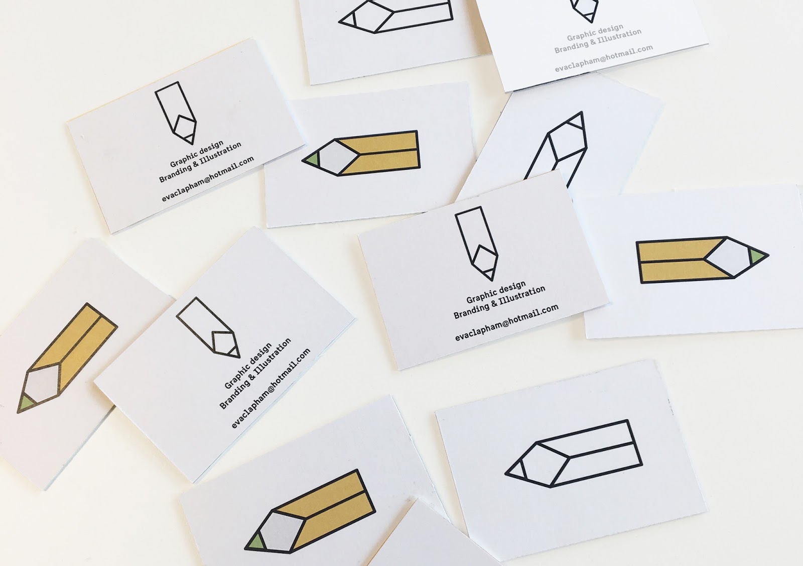
After receiving feedback on my business cards I was made aware that my logo did not necessarily communicate my name or look look a pencil like it was intended. I then experimented with different lines and colours until the logo was more successful. 

Although the logo resembles a pencil rather than my name, I think it's stronger than the previous logo. With that in mind I want to continue develop the logo until I am satisfied, so far the 'v' and 'a' are clearly visable however, the 'e' is gets slightly lost as the extended crossbar touches the bottom of the 'v' making it look like a 'y'. This can be used for now but will be developed in the near future. A the pencil represents myself as a designer, I felt the colours needed to communicate my physical appearance, therefore I simply went for yellow to reflect my hair and green as I have green eyes.


This is the CV I have made to reach other creatives and agencies. The layout is very clean and minimal yet communicates the information clear and effectively. As my portfolio will be showcasing my work and what I do I felt that my CV needed a sense of formality. However, this will be a continued work in progress and will still need developing before reaching out to the industry, I feel it lacks character and is not exciting enough to keep the viewer interested. 


These are the business cards I had developed further. Due to an error one of the lines is missing on the back of the business cards however, these are still a work in progress as I do not feel they are exciting or engaging enough for the viewer. The same yellow and dark grey theme applies throughout and I tried to duplex the business cards myself to bring substance and detail to the cards. Trying different colours such as green, yellow and black all achieved different affects. The most successful however was the yellow duplex as it went with the yellow pencil a lot better and did not stand out too much.


Elmwood are another studio that is situated in Leeds. After visiting our university for a one day brief I thought it would be beneficial to research into the studio and see what they did. As it stands they appear to be a very established agency that have multiple studios across the world. They offered services such as branding and packaging which looked very creative and professional, this is something I want to focus my practice on so will look further into contacting them to seek advice.


Something More is a studio situated in Leeds. After noticing their work in Leeds train station I decided to investigate into the studio that made it. Something more are a three man studio that has recently opened in the past year, their work consists of various projects including print and branding. This was something of an interest me so my plan is to contact them and get some advice and learn more about what they do.


Powered by Blogger.

About

Search This Blog